The main aim of a landing page is to grab a visitor’s attention and to persuade them to find out more, perhaps to sell them a product or to obtain their contact details.
Understanding what your customers want and why they are visiting your website will help you to put together the pieces of information to design a highly converting landing page. Carefully considering where certain elements go will also help keep conversation rates high.
In the world of digital marketing, a landing page is usually a separate page that’s been designed to tie in with a marketing campaign. You might consider designing a landing page for a visitor to ‘land’ on after they’ve clicked a Google or social media paid advert.
The difference between a standard web page and a landing page is that a web page will encourage the user to browse up and down the page, encouraging them to explore all the information displayed. A landing page’s focus is to get the user to click a ‘CTA’ (Call to Action), usually a visible button or link.
A great landing page can have several benefits for you and your customer. We’ve spoken about increased conversions but you are also likely to see an improved SEO ranking too. Promoting your landing page via the likes of Facebook paid ads or Google AdWords is going to get more traffic to your site, more people purchasing and ultimately you are going to see an improved domain authority score.
With a great landing page, you are also going to make it easier to turn visitors into customers. You can guide them directly to the products or services reducing the risk of losing potential customers as the usual path is to click through from page to page.
1 - First of all, it has to look fantastic. As the saying goes, you don’t get a second chance to make a first impression, nobody wants to waste their time staring at an ugly website. The most important rule of thumb here is to keep it simple, never clutter a landing page up with distractions. A clean and clear visual will help visitors digest the information easily and quickly.
2 – Descriptive, informative headings are very important. Along with making your landing page visually pleasing, you’ve got to nail the copy. Keeping your message succinct will help your visitors understand what you’re offering and why they should purchase from your website. Make sure that you get the key features and benefits of what you are offering at the top and clearly state your value proposition, stating clearly, why people should choose you over your competition.
3- Put some thought into the imagery on your landing page. Great photography can evoke emotions and encourage any visitors to click further to find out more. Typically, images that show human faces naturally generate trust.
4- Include some social proof, something like your Trust Pilot rating or a well-written testimonial can help build trust. Displaying the partners you work with can also help.
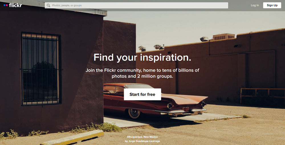
Flickr has gone with a full-screen background image or ‘hero’ image that switches every few seconds, making total sense for a photography website. They’ve kept things simple with a heading and subheading and a clear ‘call to action’. Within seconds you learn exactly what Flickr is offering and where you need to go to join.
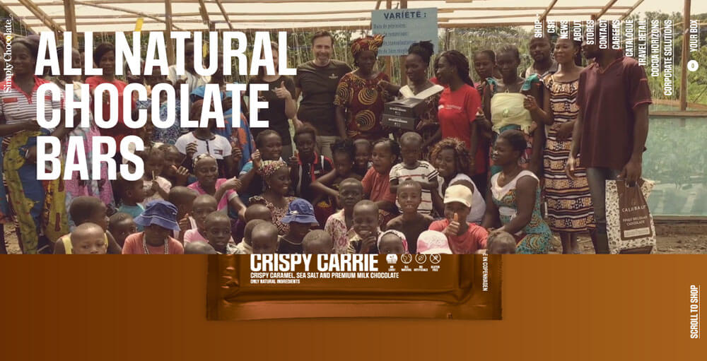
Simply Chocolate has gone for an unorthodox approach to the navigation but that’s ok, what they’ve done exceptionally well is to draw the user in. You get a sneak peek of their product but first, you get their story captured in the video, it only urges you to scroll to find out more and when you do you are delighted to see a brilliantly put together parallax scroll effect of their products.
Combing a great landing page with paid advertising is an excellent way to get visitors onto your website and increasing conversation rates. It’s somewhere where you can show off your creative flair. It’s also a good way to test different ideas, set up an A/B test and see which landing page generates a higher conversion rate.
If you need help with building a successful landing page:

Article Written by Matt Partridge
Web Developer & Digital Marketing Specialist
matt@madebyabstraction.com