Abstraction first & foremost is an agency that specialises in creating high-quality websites that look brilliant, are easy to use & help improve your customer's user experience. Abstraction is also here to create your companies logo & branding, to improve your websites performance, sales & conversion rates. We don't stop there, we also design killer graphics for your social media campaigns, business cards & flyers.
We use two fonts throughout our website, digital assets & print material.
Montserrat is a Sans Serif style font we use for headings, buttons & 'call to actions'.
Roboto Slab is a Serif style font we use for body text.
We write headings, titles, links & button copy in 'Title Case'. For our logo, we use a bespoke typeface, one that's original to Abstraction (a bit like the colonel's secret recipe).
We use three predominant colours throughout our website, these colours are:
We use #3B3F45 for our copy. When we sometimes use a dark background we will use #fff (white text) for headings & body text. We use a combination of #DA1B60 & #FF8A00 within our logo & subtly throughout our digital elements. We will sometimes use a gradient made up of these colours within certain elements to create a visually pleasing effect.
All of our buttons have been designed to be simple & noticeable. We use Montserrat in 'Title Case' format for all button text. Buttons are all in a 'pill' style format with a subtle 'growing' effect when hovered. An example of our buttons:
Our Logo is used in various formats. We use the original, dark text version when on a light background & then we flip it for use on darker backgrounds (like our footer). Our emblem of the two rounded edges, hexagonal shapes represent thought bubbles. We use our emblem in situations where only a square format is available, for example, our social media Avatars.
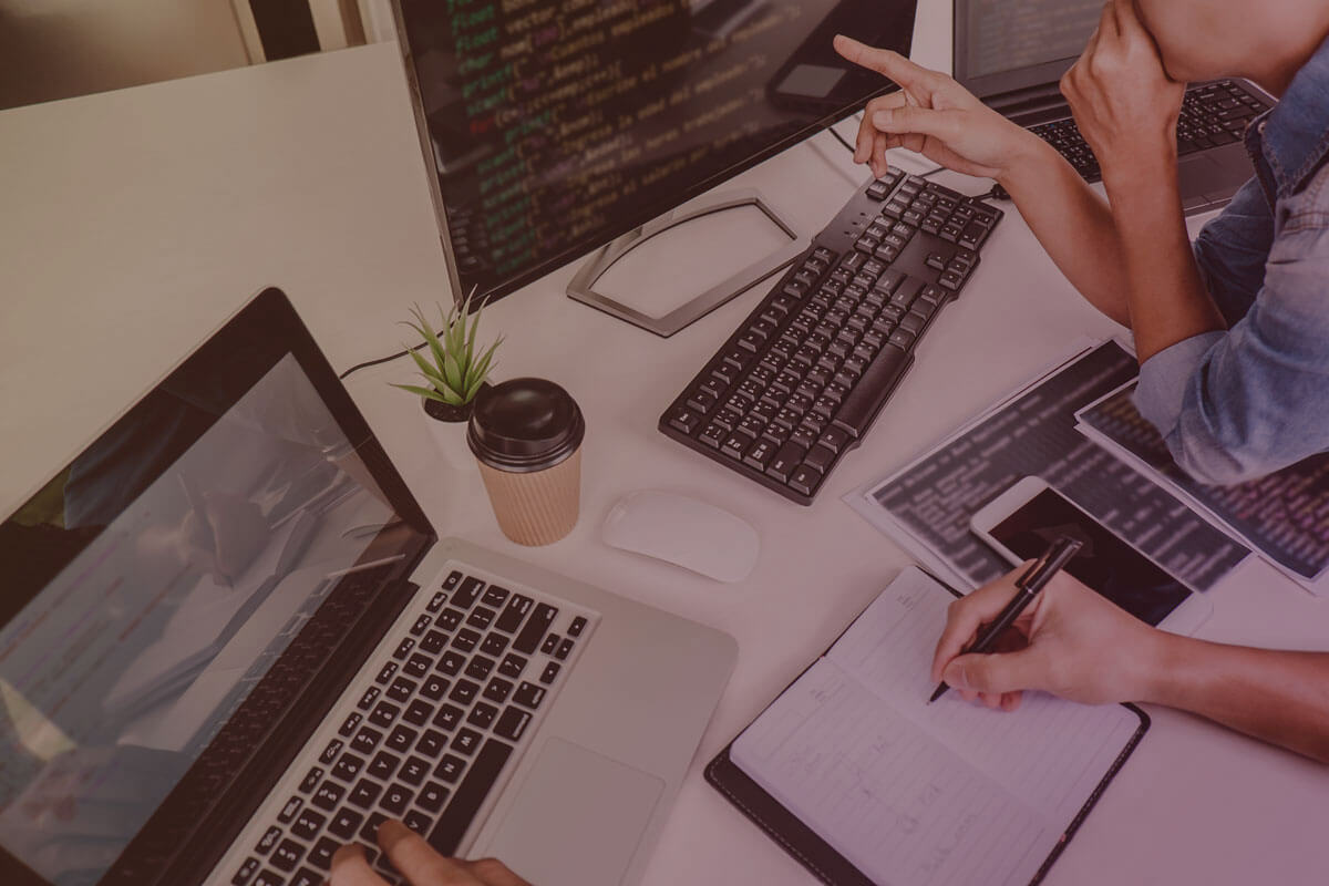
Photography used by us is first & foremost of a highly professional standard, reflecting Abstractions position as a market-leading marketing agency. We sometimes enhance our images with a subtle, soft light gradient filter made up of #DA1B60 & #FF8A00. We also take care that photos we publish that include people represent Abstraction as an inclusive & relatable brand.
Here at Abstraction, we utilise a ‘flat’ visual style. This means that icons, illustrations, & other non-photographic imagery we use is minimally styled, & makes use of solid block colours, utilising our primary brand colours. We do use a gradient effect in some of our elements however excessive visual styling, such as outer glows, pattern overlays, beveling & embossing, etc. are avoided. ‘Cartoon’-style line drawings are also avoided.